Crust Corporate
Enterprise Fintech · Multi-role Operations · Web App
Designing a financial operations platform from near scratch, structuring complexity so business teams can move fast without getting lost.
Enterprise Fintech
Industry
Web App
Platform

Project Overview
Crust Corporate is a fintech platform built for businesses to manage payments, permissions, reporting, and financial operations across teams and roles. Unlike consumer products where you're designing for one type of user with one goal, Corporate meant designing for admins, finance staff, developers, and approvers, all within the same system, all with different priorities. I came in near the start and took the product the majority of the way, covering the core platform architecture, dashboard structure, payment flows, role-based permissions, audit logging, and the developer layer.
The Challenge
Enterprise fintech platforms have a specific failure mode: they accumulate features faster than they accumulate structure. Every new capability gets bolted on, navigation grows deeper, dashboards get denser, and before long the people who need to move money, approve transactions, or audit activity are spending more time finding things than doing things. That was the risk Crust Corporate needed to avoid from the start. With multiple user roles, high-stakes financial workflows, and a product that needed to scale, the foundational design decisions mattered more here than on almost any other project. The core problem wasn't a lack of features, it was a lack of structure that could hold those features together as the product grew.
"In complex platforms, clarity is a structural problem. You don't solve it by removing features, you solve it by organising them around how people actually work."
My Role & Approach
What I owned
I came into this project early and owned the design of the core platform experience, making foundational calls about information architecture, navigation, role separation, and how financial data should be presented before any of those decisions became hard to reverse.
How I approached it
I started with the user types and their jobs, not the feature list. What does an admin need the moment they log in? What does an initiator need that an approver doesn't? What does a developer need that nobody else does? Answering those questions first made the structural decisions easier and the visual decisions almost obvious.

The central command view — giving business users an immediate read on financial activity, pending actions, and platform health across their organisation.


Modular dashboards, not dense data dumps
The default for enterprise dashboards is to show everything and let users figure out what matters. I built Crust Corporate's dashboard as a modular system, grouped sections, clear prioritisation of high-impact metrics, and visual separation between insights and actions. Users can scan and act confidently without parsing a wall of numbers. Detailed data requires a click further, but the right users make that click, and they make it quickly.
Role-aware access without role-based fragmentation
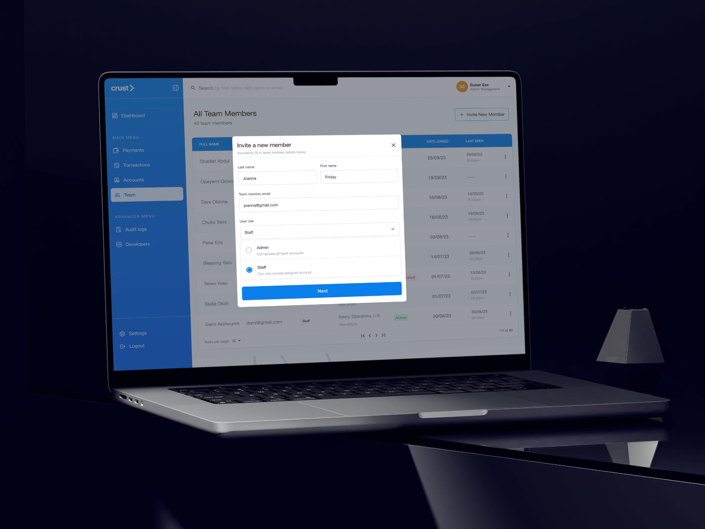
Crust Corporate has meaningfully different user types; admins, initiators, approvers, developers. The wrong response is to build completely separate experiences for each. The right response is to build one coherent system that surfaces the right things to the right people. I designed around shared patterns with role-sensitive visibility; the platform feels unified regardless of who you are, but your view is always relevant to what you're actually responsible for.

Permission design as a trust mechanism
The initiator/approver structure isn't just a workflow feature; it's how businesses manage financial risk. I treated the permission assignment flow with the same care as the payment flow itself. It needs to be clear who can do what, easy to configure, and impossible to accidentally misconfigure. That meant a two-screen flow that makes role assignment explicit and reviewable rather than buried in a settings menu.

Audit logs as a first-class feature
Most platforms treat audit logs as a compliance checkbox, something that exists but nobody designs carefully. I treated audit logging as a primary feature for the admin persona. Business users managing financial operations need to know what happened, when, and who did it; not just for compliance, but for day-to-day operational confidence. The design reflects that: scannable, filterable, and linked to the actions they reference.
A developer layer that doesn't break the platform experience
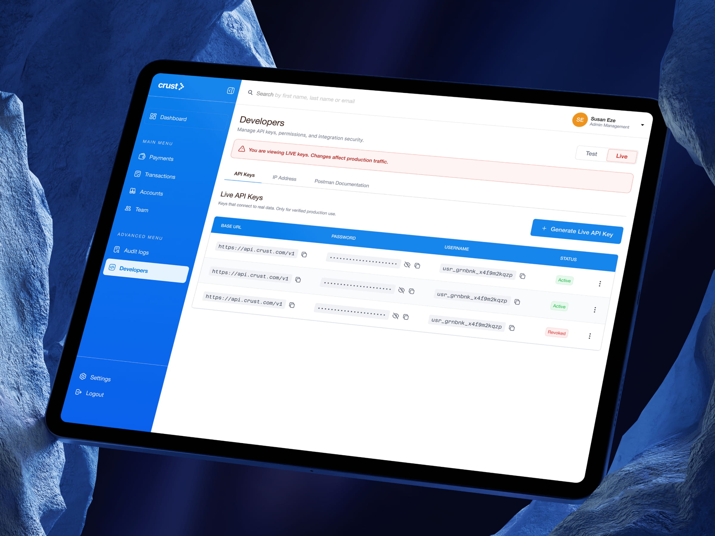
The developer section exists for technical users integrating via API, a completely different user from a finance manager. They need keys, documentation context, and technical configuration. I designed the developer experience as a distinct but coherent part of the same platform, maintaining visual consistency while serving fundamentally different jobs. The challenge was making it feel native rather than bolted on.
Outcomes & Reflection
Crust Corporate is live. The directional improvements are real, navigation that doesn't require a learning curve, dashboards that surface what matters, payment flows that handle complexity without creating it, and a permission system that business owners can configure with confidence.
The metric I don't have is the one I care most about: how often do users find what they need on the first try? Without formal usability data I can't give a number, but the design decisions made early, around information architecture, role structure, and modular layouts, are the kind that compound over time. Every new feature that gets added has a home. The system doesn't degrade as it grows.
What this project reinforced for me is that enterprise design is fundamentally about trust. Business users are managing real money, real permissions, and real risk. Every time the interface is unclear, that trust takes a hit. Getting the structure right isn't just a UX win, it's what makes the product viable in the market it's competing in.

